 5th Annual Portfolio Review.
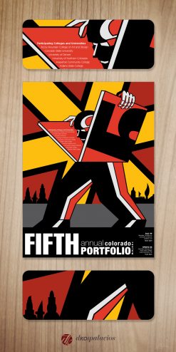
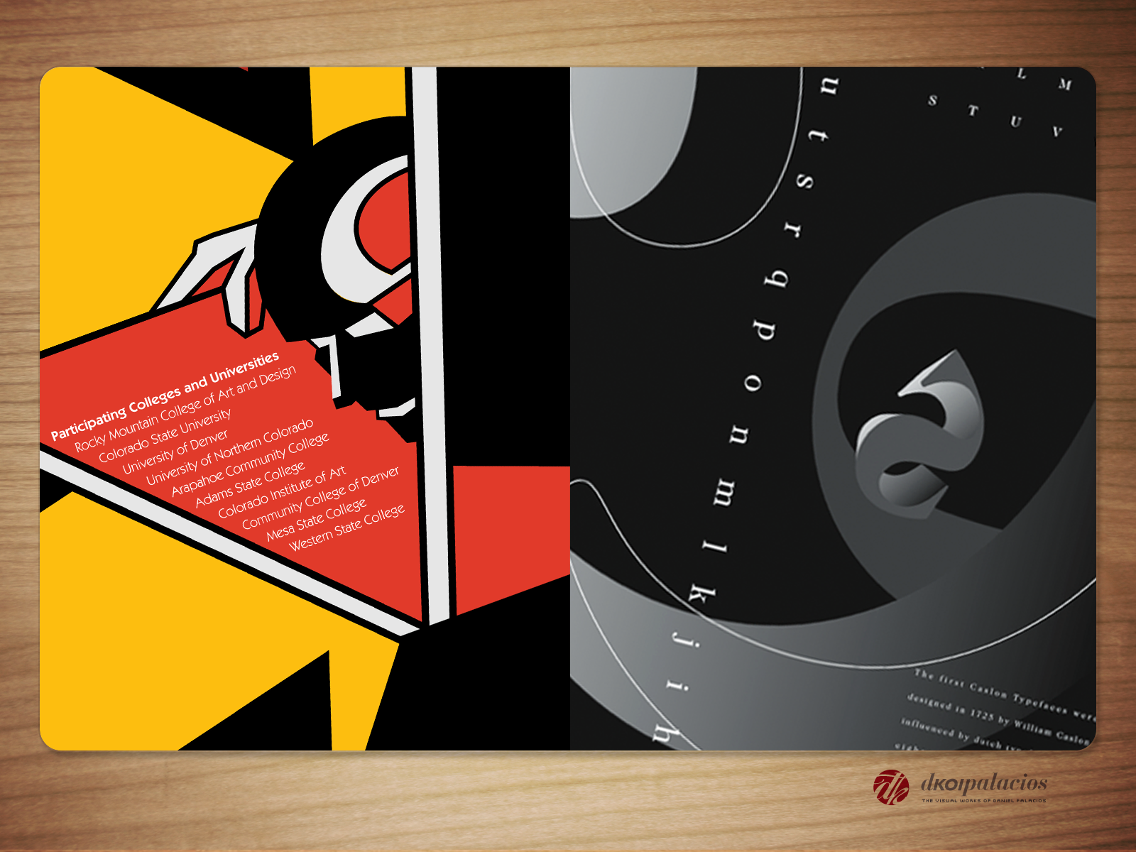
The 5th Annual Portfolio Review event served as an opportunity for artists to showcase their visual voices and communicate their unique perspectives through their artwork. As the designer of the poster for this event, I drew inspiration from the constructivist movement of the early 20th century. The final execution of the poster reflects the idea that one’s portfolio is not just a collection of artwork, but a reflection of the artist’s identity and message to the world. Through bold and dynamic design elements, the poster captures the essence of the event and the importance of visual communication in the art world.
 Caslon Pop
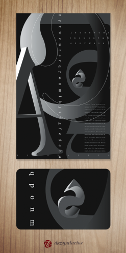
As someone who appreciates the artistry and versatility of typography, I hold Caslon 224 in high regard as one of the most timeless and celebrated typefaces in the design world. In my latest poster celebration, I sought to showcase the different details and qualities of this beloved font, which is often used in more traditional ways due to its classical forms.
To achieve this goal, I decided to explore a larger-than-life, 3D format that is not typically associated with Caslon 224. Through careful manipulation of its size, shape, and dimensionality, I was able to create a striking visual composition that highlights its inherent features of contrast, balance, rhythm, and cadence. By pushing the boundaries of its traditional usage, I was able to breathe new life into this beloved font and showcase its boundless versatility and adaptability.
In the world of design, it is important to stay true to the roots of our craft while also exploring new avenues of expression. By taking a bold and innovative approach to utilizing Caslon 224, I was able to create a design that pays homage to its rich history and artistic flair while also pushing the limits of its traditional forms. The result is a visually stunning poster that captures the essence of this iconic typeface and its enduring legacy in the world of design.

